The more Covid-19 cases are found, the more data can be collected. To collect data properly, the Jakarta Provincial Government has created a Covid-19 Statistics Dashboard that summarizes the ebbs and flows of Covid-19 cases in Jakarta. Every data presented is integrated with each other, continuously updated and transparent, so that everyone gets the same level of information. To visit the Jakarta Covid-19 Statistics Dashboard, you can open corona.jakarta.go.id, then select Region-Based Covid-19 Statistics on the Map menu. To be able to put it to good use, let's dissect the Jakarta Covid-19 Statistics Dashboard!
What's in the Jakarta Covid-19 Statistics Dashboard?

One thing that is interesting about this dashboard is the appearance of the Jakarta map. Unlike other maps, this map is able to present three data at once, namely Covid-19 statistics data, vaccination data, and Vulnerable Neighbourhood (RT Rawan) data. The color displayed on this map can also change according to which data is being presented. You can use the icon in the top corner of the map to filter the data you want to present. Apart from maps, there is a lot of other information presented in the Covid-19 Statistics Dashboard.
Covid-19 Statistics Information Map

This map presents the number of Covid-19 active cases per area in Jakarta. The blue color difference on the map serves as a marker for the number of active cases in each area. The darker the blue in an area, the higher the number of active cases in that area. And vice-versa, the fainter the blue color in an area, the fewer the number of active cases in that area.

If we select an area, the Covid-19 statistics information will be displayed in that area. From the Mortality Rate, Incidence Rate or IR, Cumulative Positive Cases, and Total Positive Cases.
Vaccination Map

To display the amount of vaccination coverage on the map, you can use the Layers feature in the top corner of the map, then select Cakupan Vaksinasi. If you pay attention, there are three different colors on the map, red, yellow, and green. This difference indicates the amount of vaccination coverage (first dose) per region. For red, vaccination coverage is at 1% to 60%, yellow indicates vaccination coverage is at 60% to 80%, and green means vaccination coverage is at 80% to 85.8%.

If we select an area in the map, information about vaccination in that area will be displayed. From the Number of Targeted Vaccinations, Number of Unvaccinated, Total Number of Dose 1 Vaccinations, Details of Vaccination Doses 1 and 2 for Gotong Royong Vaccination, Health Workers Vaccination, Elderly Vaccination, Government Employees Vaccination, Phase 3 Vaccinations, Youth Vaccinations, and Percentage of Vaccination Coverage.
Vulnerable Neighbourhood Map

To display the vulnerable neighbourhood on the map, you can use the Layers feature in the top corner of the map, then select RT Rawan. It will present neighbourhoods with a high risk of Covid-19 transmission in Jakarta. There are three different colors in the map, red, orange, and yellow. This difference becomes a marker of the status of the zone in each area. In the red zone, it means there are more than five houses that have confirmed positive cases of Covid-19 in the last seven days. The orange zone means that there are three to five houses that have confirmed positive cases of Covid-19 in the past seven days. While in the yellow zone, there are one to two houses with positive cases of Covid-19 in the neighbourhood (RT) area for the last seven days.

If we select an area, the information in that area will be displayed. From information on the names of neighbourhood (RT), hamlet (RW), district and sub-district, region, number of active cases, number of houses with active cases, and zone status.
Positivity Rate
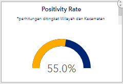
The Positivity Rate shows the percentage of the Covid-19 positive cases in all Jakarta areas and in each area. For information, the number of Positivity Rates displayed on the dashboard comes from the calculation of PCR tests carried out at the regional and sub-district levels.
Mortality Rate

The Mortality Rate presents the percentage of death rates in all areas of Jakarta and in each area, derived from the number of deaths reported due to Covid-19.
Vaccination Percentage

The percentage shown is from the calculation of people who have been vaccinated and those who have not been vaccinated, with Jakarta ID cards and those who live in Jakarta.
Jakarta Covid-19 Statistics Graph
District Graph with the Highest Positivity Rate

Graph of 50 Villages with the Highest Incidence Rate

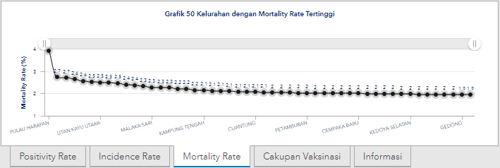
Graph of 50 Villages with the Highest Mortality Rate
Graph of 50 Villages with the Highest First Dose Vaccination Coverage

To see the details of each village, you can enlarge the graph by moving the cursor to the left or right. In addition, you can also directly click each number on the graph to bring up the name of the village. In addition to the four graphs above, you can also see data source information displayed on the dashboard.
Covid-19 Cases
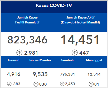
The Jakarta Covid-19 Statistics Dashboard also comes with data on Covid-19 cases in all areas of Jakarta and in each area.
Number of Vulnerable Neighborhood
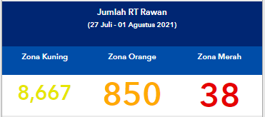
This panel presents data on the number of neighbourhoods with high risk Covid-19, both in all Jakarta areas and in each area.
Covid-19 Case Mitigation Dashboard

In this panel, there are three shortcuts to the dashboard related to handling Covid-19 cases, two of them can be accessed by the public freely. On the Dashboard Pelaporan Jenazah CRM, you can access and monitor information related to the reporting of dead bodies by the Covid-19 Task Force officers through CRM. Then on the Dashboard Kolaborasi Warga, you can access information related to Reporting, Controlling, and Completing Covid-19 Cases through CRM. If you click on the other menu, details of the vaccination coverage will be displayed both in all Jakarta areas and in each area.
Special Features and How to Use the Jakarta Covid-19 Statistics Dashboard

To filter the information you want to display in the dashboard, you can use features like Pilih Kelurahan, Pilih Kecamatan, dan Pilih Wilayah. You can also use the existing features on the map, such as the Search feature to search for a specific area, the Legend feature to view map descriptions, the Layers feature to view map options based on the information displayed, and the Basemaps feature to select the visual appearance of the map. You can also zoom in on each panel on the dashboard by clicking the zoom-in icon.

There is one more special feature that can only be accessed by Jakarta Provincial Government officials, namely the Dashboard Detail Kasus Aktif DKI. This dashboard contains detailed information on people who are recorded as positive Covid-19 patients, such as home addresses and so on. This dashboard aims to help officers monitor self-isolation patients at home.
Behind the Creation and Utilization of Dashboards
The large amount of information summarized on the Jakarta Covid-19 Statistics Dashboard is the result of the hard work of various parties. The Jakarta map, which is on the dashboard, has been transformed into a Covid-19 statistics map by the Jakarta Provincial Department of Human Settlements, Spatial Planning and Land (DCKTRP). Of course, with the support data from the corona.jakarta.go.id website, the Jakarta Health Agency, the Jakarta Smart City Data Analysis Team, the Jakarta Population and Civil Registration Service (Dukcapil), and Jakarta Satu (jakartasatu.jakarta.go.id). Apart from maps, the various information panels in the dashboard are also the result of collective hard work. The information updated daily through data integration between the Jakarta Health Office Surveillance team, JSC Data Analysis team, and DCKTRP.

(KPI Status on Reported Dead Bodies Dashboard)
The benefit that we can feel the most from this dashboard is the ease of accessing information related to Covid-19 statistics in Jakarta. In addition, the Covid-19 Statistics Dashboard can also be used to monitor the performance of each agency under the Jakarta Provincial Government, whether the KPI (Key Performance Indicator) of each service has been achieved, has not been achieved, or is not achieved.
With the disclosure of information through the Jakarta Covid-19 Statistics Dashboard, hopefully we can all continue to increase our vigor in fighting the Covid-19 pandemic. Don't forget to download JAKI via the Google Play Store or App Store to get more information about Covid-19.
 112
112